Making Windows 8 Suck Less
A while back I posted a very brief overview of Windows 8 after I had test-driven it for about a week. Alas, it was a pretty negative review, primarily because of the fact that Windows 8 is such a touch-centric operating system. It's both a strength and a weakness: if you've got the hardware to support it, it actually works fairly intuitively; if you don't have the hardware, it's an incredible pain.
Microsoft tried to make a huge leap in its attempts at a "hip" factor to its software, and in general it is much more hip than Windows 7. I nevertheless find it very frustrating, disenchanting, and somewhat deceitful to encourage Windows 7 users to upgrade knowing full well that most of us are using computers that don't have touchscreens or even very good touch pads. I had upgraded my Lenovo which was using Synaptics multi-touch drivers which, honestly, worked just okay. They weren't great. But they did at least work for the most part. For whatever reason, though, they didn't work in Windows 8 Store Apps. This, of course, limits you only to the desktop in which case you might as well've stayed with 7.
Touch pad Drivers
The truth of the problem is that it really is only a software issue--most folks' touch pads actually do support multi-touch, but the drivers just aren't written for them. So I was excited this morning when I found out that HP had released some touch pad drivers for their laptops that support multi-touch well and even include support for Windows 8 gestures. I don't have an HP laptop, but the drivers work equally well on any other laptop with a Synaptics touch pad. After restarting, voila! I now can use left-, top- and right-edge swipes. Two-finger scrolling works great. If you want to read more about what's supported, read this.
Pokki
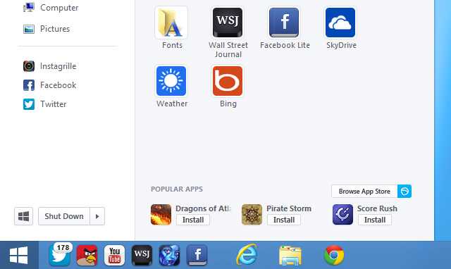
My other complaint with Windows 8 was the removal of the start button from the desktop. Why? Why would you do that, Microsoft? Apparently the concept of "graceful transition" didn't make it in their design meetings. Anyway, a new app for Windows called Pokki replaces the start menu and offers plenty of customization. It's a clean, well-designed replacement, and I would highly recommend it. Apparently so would many others, seeing as how it has enjoyed installation on 2.5% of all Windows 8 installations so far. It doesn't sound like much, but in the few months that Windows 8 has been out 2.5% says that plenty of people are a bit frustrated with the lack of the familiar button.
 Pokki's new start button for the desktop. (Photo courtesy of The Verge)
Conclusion
If you've upgraded to Windows 8 and are lamenting your decision, perhaps these two tips will help smooth the experience for you. Good luck!