

Kindling a Revolution in Reading
We bookish types are straddling two very disparate worlds right now. The old world is that of the wonderful used bookstore crammed with too many floor-to-ceiling bookshelves which are in turn crammed with too many used books, each ripe enough to give off that certain scent of a well-loved book. It's a world that carries a certain comfortable nostalgia for me, like a grilled cheese and tomato soup on a rainy day. It's also a world that has been massively overturned by the meteoric impact of a new world: digital reading.
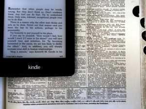 Two worlds collide.
Kindles, Nooks, Kobos, and all the other knock-offs each come to the ring with none of the nostalgia but with legions of features that make them far more appealing than a traditional book, such as the ability to carry not only a book but an entire library wherever you go. I am personally torn, as perhaps you are, between the joy of reading a hard copy of a book and enjoying the conveniences of the Kindle. I wanted to reflect here on what I've found to be valuable about the Kindle ecosystem and then offer a few suggestions on how it could improve.
What I Enjoy About My Kindle
Overall, I have been duly satisfied with the device over the past year. It's a great form factor, and (in my opinion) has a more pleasing design than its competitors. Tight integration with Amazon means I can purchase just about any book I need (for cheap!) and be reading it in seconds. The refresh rate is speedy, so turning pages no longer suffers from former lag that would derail my train of thought. The Paperwhite lives up to its name with internal illumination that can get incredibly bright.
Though many people are opting for tablets for their multi-functionality, I was interested in e-ink devices for two reasons: 1) I don't want to be able to do anything other than read with my device (I'm easily distracted as it is), and 2) I want to avoid the eye strain of reading for long periods of time on a backlit device. Though e-ink displays feel clunky and dated compared to the current level of fluidity on something like a tablet, it was a cost I was interested in paying.
Amazon obviously wants you to be purchasing books through their massive online store, but it's also possible to download books from third-party retailers and email them to your Kindle, where they are also stored in your own personal document cloud. You can also check out ebook versions of library books via overdrive.com, which stay on your device for the length of the checkout period and then delete themselves.
I can read an ebook as fast or even faster than a traditional book, given the ability to customize and fine-tune typography to my own personal needs. One of my favorite features of Amazon's Kindle ecosystem is cloud syncing, so that I can start a book on my Kindle and then pick up where I left off automatically on my phone while waiting in a line or on my computer when I don't have my Kindle with me. Highlights and notes sync as well, which comes in handy when I'm reading for school.
What I Wish Were Different About My Kindle
Though my experience has been largely positive, the technology still has plenty of room to mature. Here are a few things I hope to see in future iterations of digital reading:
Better desktop apps.
The software for the Paperwhite and the iPhone app receive fairly regular updates and are quite commendable, but it's a different story with the Windows 8 app and the web app (I have not tried their apps for Android or Mac). One of the biggest selling points for the Kindle is the universality of your library: you can read it on pretty much any wifi-capable device you might own. The idea is great on paper, but the implementation is bare-bones at best and frustratingly confusing at worst. Neither the web app or the Windows app support collections, which makes sorting your eBooks rather pointless if they appear as just a big heap in some of the apps. The current situation would perhaps be somewhat more permissible if desktop filtering options were as robust as those on mobile and Paperwhite, but they aren't. The most filtering you can do is between "Cloud" and "Downloaded," but you're out of luck if you'd like to see only Docs or Periodicals. There are other negative observations I could make, but instead I'll turn to making positive contributions to what desktop apps could mean within the Kindle ecosystem.
My dream for desktop Kindle apps goes beyond the mere ability to present your purchased content on a different device. What if Amazon leveraged the strengths of a desktop computer (namely, its large screen, physical keyboard, and mouse) to make a Kindle app specifically designed for research and analysis? I obviously have academic works in mind more than your average pleasure reading, but it would be immeasurably helpful to be able to quickly sort through all my highlights, notes, and bookmarks and export them to various bibliographic formats. Further, what if Amazon souped up its search algorithm so that it not only did the job of returning results, but did it excellently? As Google knows well, a user isn't usually looking for every occurrence of a phrase, but rather a specific instance of that phrase. Smart search lists results not necessarily in chronological order, but instead ranks them by relevance. When I am writing research papers, I am sorting through hundreds upon hundreds of quotes. I would like a search function that helps me find what I'm looking for faster, rather than just providing a rough index of word occurrences. It is possible to use Kindle eBooks for academic reading, but the system clearly is not designed to make it easy. Better desktop apps for Kindle would mean a positive contribution to the world of reading that would progress beyond the limits of physical books.
Better typography, consistency, and polish.
Another frustration with the Kindle ecosystem is its lack of standardization or consistency. One cannot expect the interface elements to be in the same place across different apps: the back button on the Paperwhite is in the top navigation bar, whereas on every other app it is in the lower left-hand corner. Syncing on the Paperwhite is in the drop-down menu; on the iPhone it is in the sidecar menu; on the web app it is in the top bar. When it comes to searching, on the Paperwhite it is in the top menu on the right side. on the iPhone it is in the sidecar menu; on the web app it is in the top menu on the left side. In the Windows 8 app it is in the Windows sidecar navigation panel on the right side of the screen. Some of this is due to operating system-specific design standards, but this alone does not account for all the inconsistency.
As mentioned above, filtering is simply not available on Windows 8 or the web app. On the iPhone I can filter down to Books, Newsstand, Docs. and Collections. On the Paperwhite I can filter down to Books, Periodicals, Docs, Collections, and Active Content. The lack of standard vocabulary is, simply put, confusing.
One of the neat features on the Paperwhite and iPhone is their time-to-read feature at the bottom of the screen (it tells you how long it will take you to finish the chapter or the book). This, unfortunately, is absent from the Windows 8 app and the web app.
Further, there is a lack of standardization across different Kindle eBooks: some have page numbers correlating to physical editions, while some only have digital location numbers. Most books allow you to fine-tune typographic settings to fit your personal needs, but some books puzzlingly do not. The Paperwhite has another handy feature in its "Go To" menu that allows fast access to the table of contents, but this also is not available for every title (even though those titles it is not available for do in fact have tables of contents). I'm sure there's an understandable technical reason for this inconsistency, but it's another example of a lack of polish.

A lack of standard feature sets between different books in the same digital eBook ecosystem is confusing and irritating. On the left is a book that doesn't allow access to its table of contents in the "Go To" menu, while on the right is what many books offer.
I risk sounding whiny and petulant with complaints about polish, but for me it significantly impacts the reading experience. If Amazon wants a monopoly on the eBook market, the least they can do is provide top notch apps for users to access their purchased content.
Real-time Syncing.
As I said above, syncing works fairly well, but if you need to switch from one device to another immediately, you usually can't. It takes a minute to sync reading locations, and notes and highlights take even longer. Greater seamlessness here would make for a much smoother reading experience.
Disabling Automatic Screen Turn-off.
The Paperwhite automatically turns its screen off after a few minutes of inactivity, which is usually a good thing. It's frustrating, however, when you're trying to reference a certain text while writing a paper and the device keeps putting itself to sleep. I haven't found any way to turn this feature off, which is irritating.
Conclusion
All in all, I have found my Kindle Paperwhite, and the Kindle Ecosystem in general, to be convenient and useful. That being said, it still has a ways to go. I understand that Amazon's primary aim is to make money by selling books and that their Kindle devices and software are only means to that end, but I hope they understand that they could only gain happier customers who thus spend more money by making the reading experience more smooth, beautiful, and useful. A greater attention to the little details would, in my opinion, be a much more rewarding update than some fancy new (yet half baked) feature such as X-Ray or Goodreads integration.