

ESV Illuminated Art Journaling Bible [a review]
What is the purpose of owning a personal Bible? While for some a Bible might satisfy the need to be connected to something transcendent, I'd imagine many people would purchase a Bible so as to read it. Unfortunately, a majority of English Bibles in print are what I would categorize as "basically illegible." Just as poor handwriting unnecessarily impedes the reader's ability to comprehend a writer's meaning, so too do many publishers impede readers from comprehending the Bible's meaning. When a Bible is set in 8pt font with some ugly font face on see-through paper in two columns and the lines of biblical poetry are wrapped around themselves in knots, and... I could go on, but what you end up with looks more like a dictionary or an encyclopedia than something fitting for the divine words of the Creator of the universe. The Bible is not reference material, and we ought not treat it so.
 It is for this reason that I am endlessly grateful for the work Crossway has done as a publisher over the years to push the envelope on just how readable a Bible can be. It is my belief that if the biblical text is set beautifully and read well, it can actually be understood far more easily than most people believe possible. In other words, I am saying that these factors matter just as much as the content of a translation, and they matter more than the presence of study notes, for the end goal of helping human beings understand God's words to them.
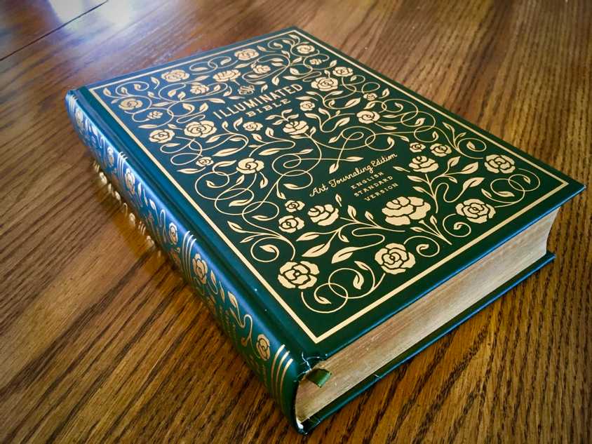
Recently Crossway published The ESV Illuminated Art Journaling Bible, an edition of the ESV text graced with extra wide margins embellished by stylistically rendered pull quotes and flourishes. The margins are wide enough for writing down a thought or two, but they're still only a couple inches wide. It is single-column (basically a must in my book) with a font size readable for the average eye. The cream-colored paper is a little bit see-through, but for the most part it has been fine-tuned for readability.
Each book introduction in the Bible receives a lush, full-page illumination by artist Dana Tanamachi. These are easily my favorite part of this edition, to the extent that I would say they are actually more valuable for the average reader than the traditional who/where/when book introduction. Why? Because what is most needful when opening the Bible is not to have all your questions answered before you think to ask them, but to have your imagination fired enough that you might actually ask those questions in the first place and then pay close attention to the text to find your answers. For example, the title page of Ezekiel centers upon a heart crisscrossed by veins with flowers emerging from it. Intriguing! Why would Tanamachi have chosen that to illuminate the book of Ezekiel? Is the book of Ezekiel about heart surgery? It makes me want to read the book to figure out the answer to my question!
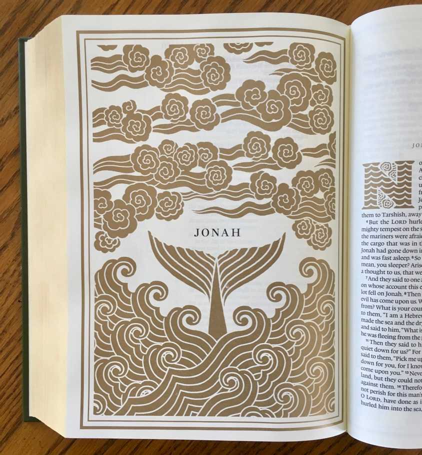
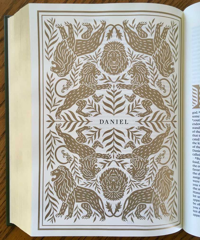
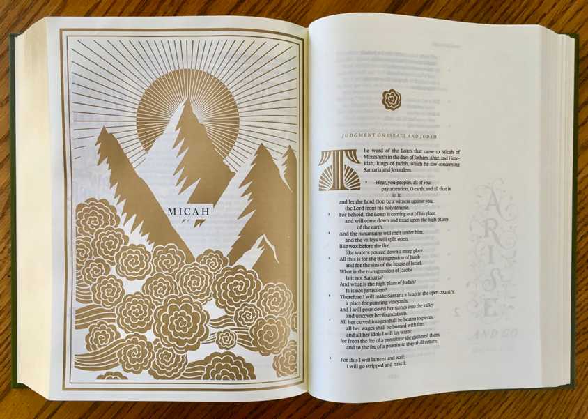 Some of them are rather obvious (Daniel is illuminated by lions, Jonah by a whale), but perhaps my favorite example is for the book of Micah. Gone are the floral flourishes that define most of the illustrations throughout the entire Bible, and instead there are heavy winds and rugged mountains, one of which is so tall that it blocks out part of the sun. Fascinating! What does Micah have to say about mountains? Is the point of the book somehow represented by the wind blowing on a mountain? The illumination draws me in rather than satiating my curiosity before it has even been piqued.
All that said, there are some drawbacks to this edition, in my view. While it is gorgeous in many regards, it is almost too beautiful-it's eye-catching enough that I might leave it out on the coffee table or on the mantle so that other people can see it rather than it being something I really want to journal in. It's very instagrammable, but that's not much of a compliment; Jesus had choice words for those whose religious impulse centered mostly around being seen by others (Mat. 6:5). The question is rather whether it fosters deeper engagement with and comprehension of the flow of thought in the Bible.
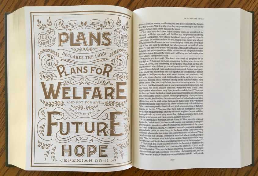 The other main downside I see is that while the book title illuminations are exceedingly valuable, I found the verse illuminations in the margins to actually detract. Rather than drawing you in to the narrative, as the book titles do, they lift verses out of their context, causing one's attention to focus inordinately upon one verse at the expense of the paragraph or the chapter. Furthermore, it is typically the "coffee mug" verses that get special treatment as opposed to the less cheery verses that are just as important to our understanding of God's work in our world. For instance, Jeremiah 29:11 gets a full-page treatment, but weirdly enough Amos 5:20 ("Is not the day of the LORD darkness, and not light, and gloom with no brightness in it?") does not get such attention. I jest, but is there not more to the Christian faith than what can be happily pasted on a coffee mug or sung about on K-LOVE? Is there not first bad news before the good news of the gospel? The Word of God is a sharp, two-edged sword that pierces us, slicing through our pretensions and cutting us to the quick of our folly. If the happy verses are in gold 48pt font and the uncomfortable verses in boring ole 12pt font, we unintentionally skew the balance of God's words to us. The intent of these pull quotes is to highlight God's salvific plan throughout the whole Bible, but I'm hesitant to say that they really accomplish that.
In the end, this really is a lovely Bible. The book title pages are an excellent edition, and the text is set well. The verse illuminations in the margin are pretty, but ultimately detract from the reading experience. I would recommend this for someone who is looking for a Bible in which they plan to take a lot of notes and who does not mind writing on such a polished specimen. There are other ESV editions that I would probably recommend first, but a dream would be something of a stripped-down version of this: well-set text, imagination-provoking title pages, and otherwise a clean, clear page that lets the text itself take center stage.
You can pick up a copy from Westminster Books for $14 or from Amazon for $28.
DISCLAIMER: I received a copy of this book from the publisher for the purpose of a fair, unbiased review.