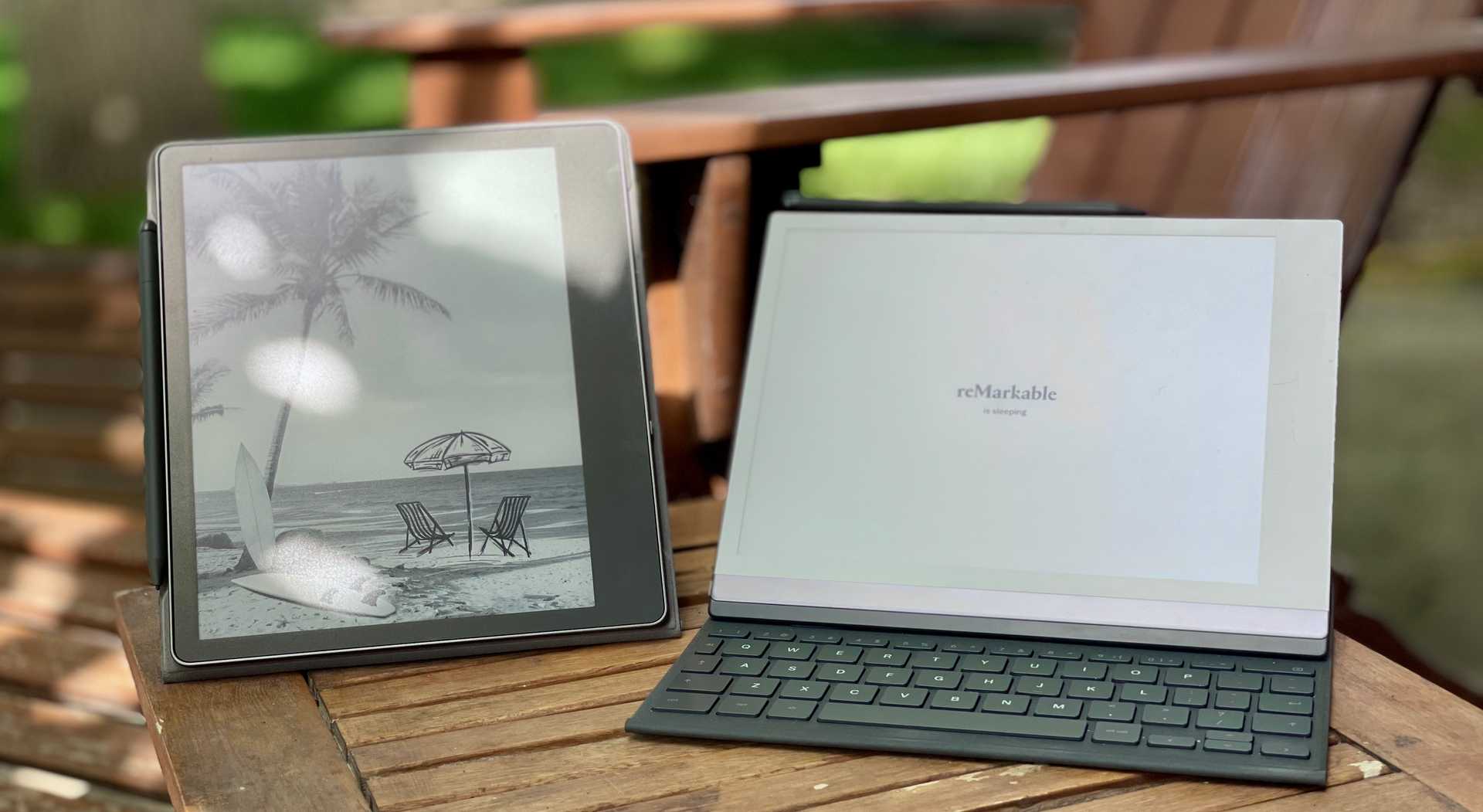
Scribe vs. reMarkable 2: a Review for Writers
Intended Audience
The Kindle Scribe and the Remarkable 2 are both multifunctional devices, and there are many personas that would use them for drastically different purposes than me. I will be reviewing these two devices for those who want to use an e-ink tablet primarily for writing more than anything else. If you're looking for a simpler spec comparison, read Lifehacker's post comparing these same two tablets, or Engadget's comparison of these plus the Supernote X, Onyx Boox Note Air 3, and the Kobo Libra Colour.
tl;dr
While I think both devices would prove more or less useful to a writer, I think the reMarkable 2 is a generally better device:
- The operating system orbits primarily around your files rather than around Amazon's bookstore
- It has more useful controls for writing, manipulating, and transforming text
- You can buy its Keyfolio case to turn it into a sleek, modern "typewriter" of sorts
- It receives regular, thoughtful software updates that are always quite useful
The Scribe easily beats the reMarkable on other fronts, though, largely because the Scribe has newer hardware:
- The Scribe has a much crisper, higher-density display (which is good for your eyes) and the display's refresh rate is super fast
- The Scribe's battery lasts significantly longer
- The Scribe has nice features like a backlight and dark mode
- It's much cheaper
For the cash-strapped or for those who have significant personal buy-in to the Kindle ecosystem, the Scribe might make sense. Despite the reMarkable's aging hardware, though, I generally just like it much more. With the rest of this review (most of which I wrote on my reMarkable!), I'll flesh out why.
Personal Background
I've always been intrigued by e-ink devices; I think the premise of a lightweight device with a screen that uses actual ink rather than shining a light in my eyeballs is great from a digital health standpoint. Their battery life has always been an order of magnitude higher than anything you could get in a tablet or laptop, which is good for the environment. I bought a Kindle Paperwhite back in 2013, and it lasted me about a decade, which is impressive for any kind of computer hardware these days. My Paperwhite had a touchscreen that allowed me to highlight sections of text as well as add notes via the on-screen keyboard, but it was clunky at best. It made me long for the day when a legitimate e-ink tablet would come on the scene that could replace my stacks of notebooks.
I traded that Paperwhite in for a Kindle Scribe in December 2022, a month after it came out. It was pretty cool to finally have an e-ink device that I could both read and write on, but the first version of the software was extremely barebones. It was apparent that Amazon's main goal was to release a device in reMarkable's category at a lower price point and with just enough features to steal some market share. Even though they now had a Kindle device with a stylus, you couldn't meaningfully use that stylus to mark up Kindle books—the highlighting experience was equivalent to just using your finger, and you couldn't write in the margins, underline text, etc.1 Notebooks (kind of the big selling point of the Scribe) felt like an afterthought in the interface; the main tab is for buying more stuff from Amazon, the second tab is your library, and the third tab is finally where you can find your notebooks.
After 6 months of using it and a few cursory software updates, I liked it, but I didn't feel like my money had been super well spent. So I purchased a reMarkable 2 to compare and contrast the two devices. Unlike the Scribe, it's really not a reading device. It's possible to load up non-DRM ePub files, but even so the reading experience is pretty lackluster. It's obviously not the reMarkable's raison d'être. Notebooks, however, clearly are.
Notebooks
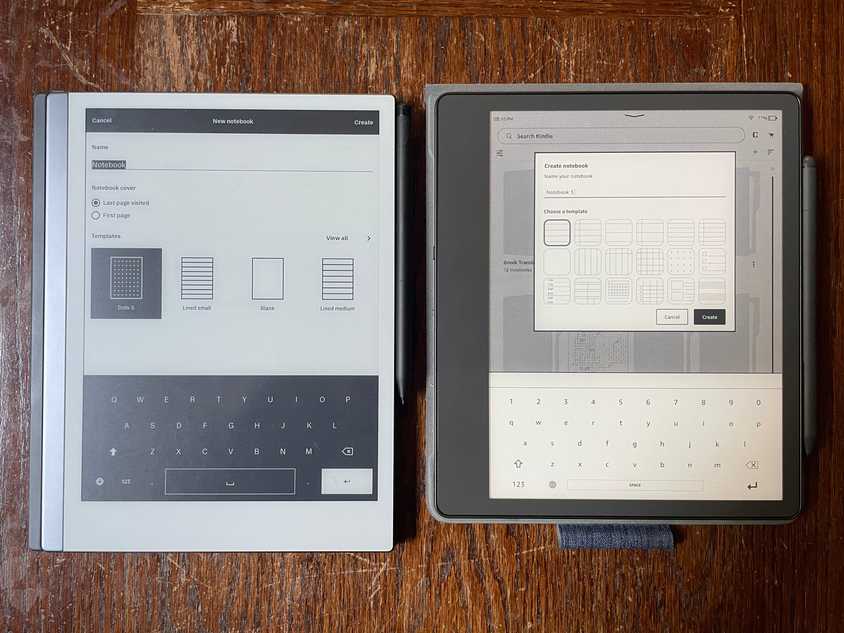
Creating a new notebook on both devices is actually quite similar: you name the notebook and then pick a template. The Scribe currently has 18 templates you can pick from. The reMarkable surfaces your 4 most recently used templates, but it has almost 50 that you can choose from for all sorts of different purposes. You can swap out the template on an existing notebook on both devices.
Once you're in an empty note, both devices have a (hideable) toolbar. This is an aesthetic preference, but personally, I find the reMarkable's UI design here significantly more pleasing. On the Scribe, even when you hide the toolbar, you have this big, ugly black spot hanging out in a random spot right where you want to write. You can move it to the right side of the screen, but it still feels awkwardly far away from the top of the screen. The reMarkable has a lot more tools, and they're much more thoughtfully placed. I change pen weights somewhat often while writing a note, but for the most part, I just need the toolbar hidden and out of my way. That's what the reMarkable does.
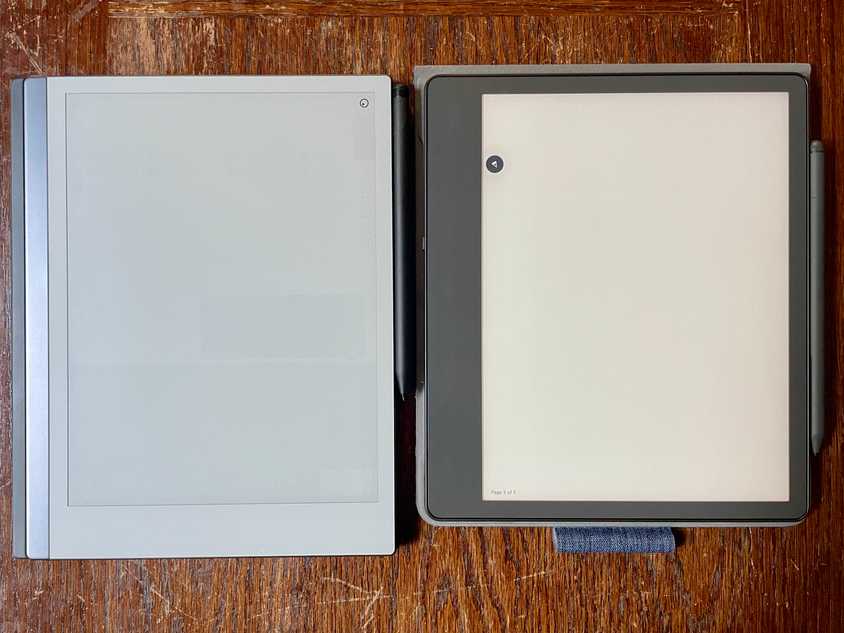 | 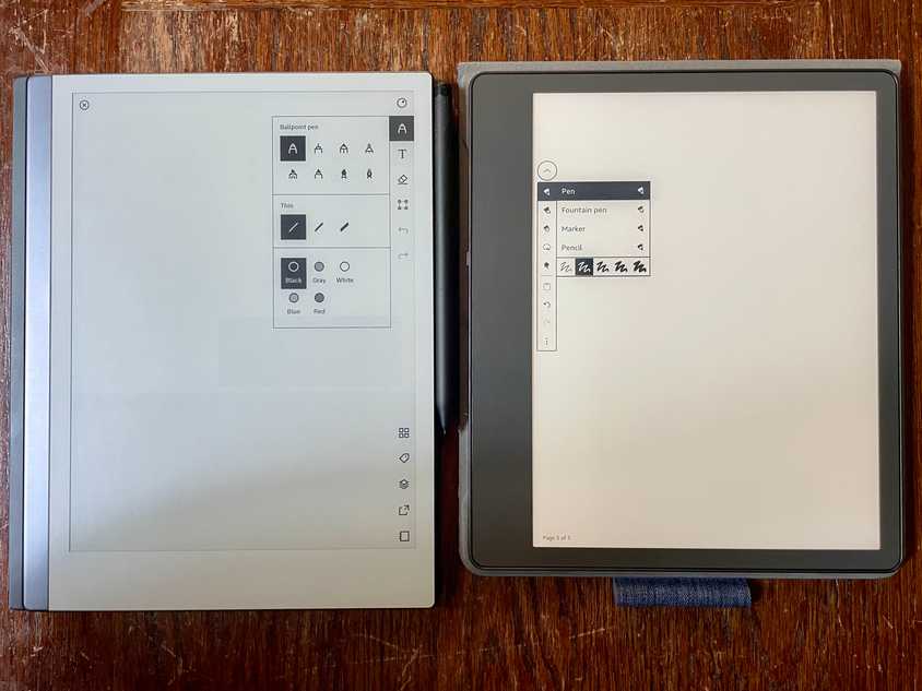 |
| Toolbars closed | Toolbars open |
Typed text
This is not something you can even do in a Scribe notebook, so this section is only a review of the reMarkable's capabilities. To be honest, the most relevant competitor on this front right now is probably Daylight Computer's DC-1.2
If you want to type on a reMarkable, you can either use the on-screen keyboard or you can purchase the Keyfolio case. The on-screen keyboard works, but I can't imagine using it for anything other than very light text input—it's awkward in all the same ways as typing on an iPad software keyboard.
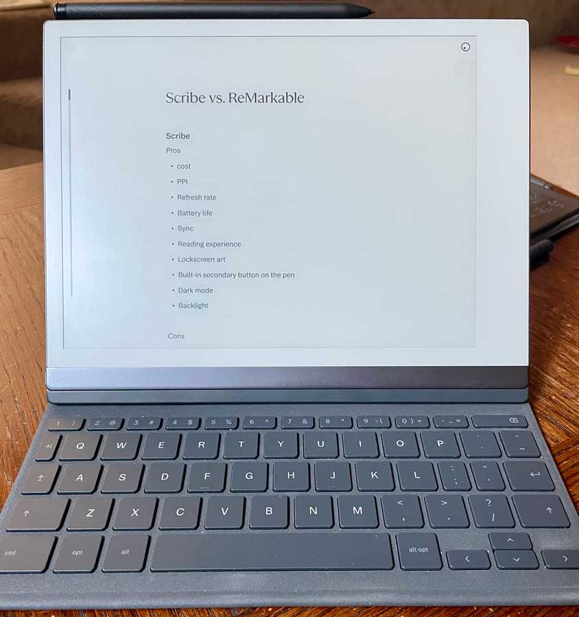
Typing with the Keyfolio is actually pretty good, though! I wrote a lot of this review on it while sitting in a cramped little airplane seat over the Atlantic. When it first came out, there was a pretty noticeable lag between keypress and rendering the character on the screen. For those who type fast, it's a deeply unpleasant experience of typing words and then seeing them get all barfed onto the screen at once a second or so later. Luckily, though, this situation has improved over time such that I can type basically as fast as I am able, and I can see each letter rendered on the screen mostly instantaneously.
The typography feels really quite nice; titles are rendered in an elegant serif to set them off from the sans body text. It's all quite basic, though; you only get two heading levels, bullet and checklists, bold, and italic. That mostly gets the job done, but even in something as simple as this blog post, I'd definitely have used a third heading level and numbered lists if they were available. Oh, and it would be delightful to have markdown support too! (Typing # header is always so much nicer than having to use a dropdown to accomplish the same).
The Keyfolio supports a Mac-like or Windows-like key map, so if you're used to shortcuts like cmd+B or cmd+ArrowLeft, you'll find those shortcuts work on this device too. Even cmd+tab works to switch between notebooks! It's a pleasant surprise to see that level of attention to detail.
That attention to detail gets at the reMarkable company's seeming desire to develop a genuinely useful tool rather than just something that's good enough to sell units. Someone there has thought about the jobs to be done and then made sure they're not only possible but smooth. A case in point is the ability to write notes by hand, use the selection tool to draw a lasso around it, and then convert it to typed text. This feature isn't necessary by any means, but the fact that it's there has saved me time when I have to email out my written notes to other people.
Another example of them pushing boundaries is what happens when you use the pen tool to annotate typed text. If you draw an underline on some text and press "enter" above it, the drawn annotation sticks with the text! The downside is that if you email the note as text, you lose all these annotations. I'll elaborate on the shortcomings in export later, but suffice it to say that it would be great if they could intelligently convert underlines to actual underlines, or convert a circled word to bold or something. The highlighter tool actually does work like this: if you draw a highlight stroke roughly over a word, when you raise your stylus your stroke gets transformed into a real highlight on the text.
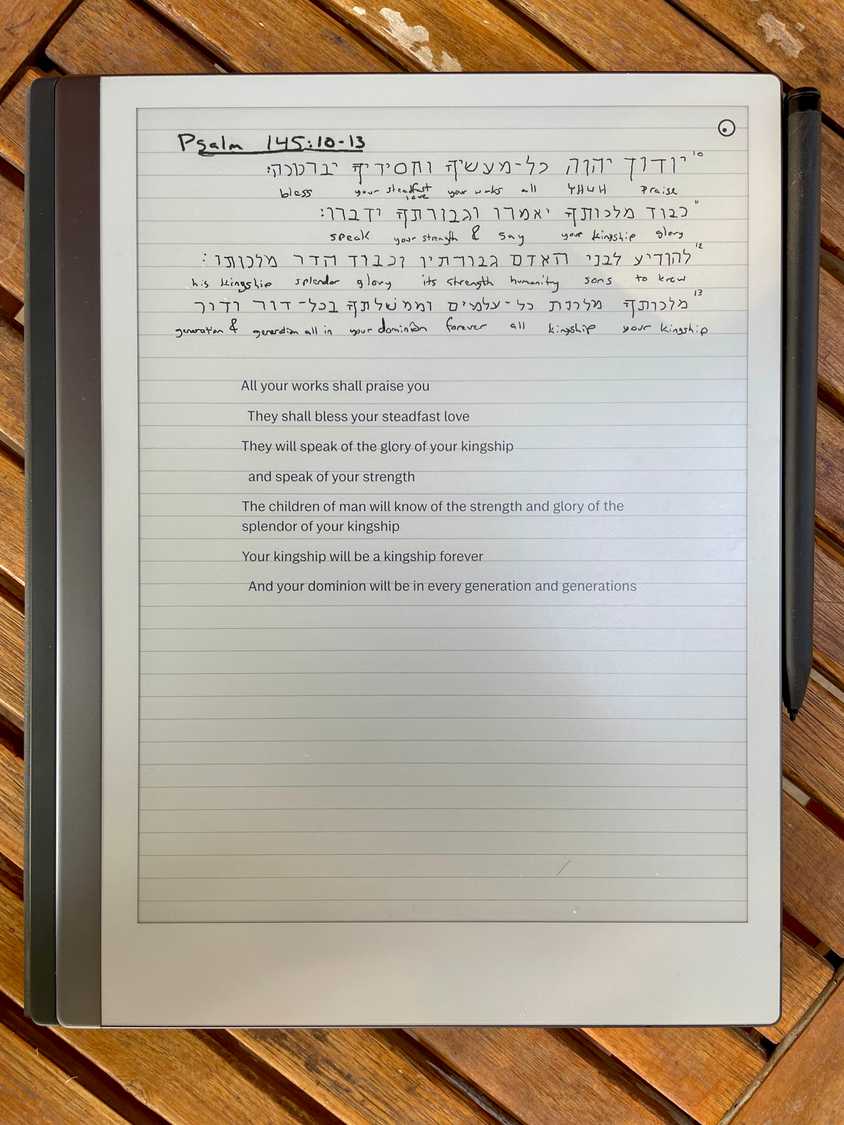
This sort of "object permanence" between text and drawn annotations also comes in handy if you want to insert a figure or illustration. In something like MS Word or Apple Pages, while you can insert images into the flow of your text easily, it's still a far cry from the experience of writing on paper where there's no synthetically imposed distinction between text and drawing. Luckily, with the reMarkable, the experience is much more similar to pen and paper than it is to word processing software; you just draw what you need and then continue typing afterward. It's pretty great.
The one annoyance that arises, though, is that typed text is unaware of the template that you're using. Let's say you use the narrow ruled template for handwriting, and then convert that to typed text. You might expect the text's line height to be adjusted to match the template, but it doesn't. Instead, it just looks really awkward.
As a result, I find myself following a workflow of using a template when I'm handwriting and then removing the template when I want to start typing on the same page. It's not ideal, but it works.
Organizing typed text
One of the little details that becomes a problem fairly quickly is the mismatch between a notebook's paging and the way typed text just flows off the bottom of the screen on a single page. What you end up with in a blog post like this is one super long page that's a pain in the neck to scroll. It would be incredible to automatically flow text from one page to the next, or perhaps have some kind of shortcut such as a line divider that you could tap on and convert into a page break. My favored writing software on macOS, Ulysses, allows you to split a document into multiple sheets this way:
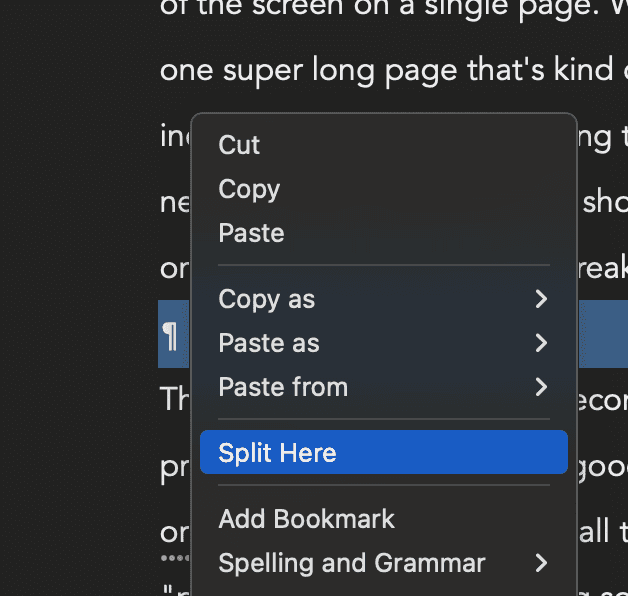
This is the sort of feature that would transform the reMarkable from a "write here, edit elsewhere" device into something where I could see myself actually reviewing/editing on-device.
Another key feature would be full-text search from My files. Currently, if I search for something I've written here, I won't find it—I can only search by notebook titles. The Keyfolio has already made the reMarkable feel like it's in a class of its own compared to the Scribe; adding better organizational tools would elevate it even further into a device class that a professional writer could replace a laptop with more fully.
Synced content
The obvious benefit the digital world has over paper is the ability to trivially copy, reformat, edit, and move text. We're so used to sending documents or even links to documents that we barely think twice about it anymore… until an app prevents us from being able to seamlessly share/export content. A long time ago, I used an app called Quip for my notes (back before it was acquired by Salesforce and became a productivity suite) but after writing a lot of content in it, I discovered the hard way that there was no easy way to move my notes elsewhere. I ended up writing my own little app, Quip Mass Exporter, to do the job, but it made me realize how important it is to be able to own your own files.
How do the reMarkable and Scribe fare on this front? Honestly… not great. I would expect the Scribe to absolutely slay on this front because it's built by Amazon (the company that just so happens to own the world's largest web services business) but it's far less impressive than you'd guess. Other than the pre-existing Send to Kindle app, it's not that convenient to get files to and fro between the Scribe and my laptop. The bare minimum functionality I'd want is to be able to connect a USB-C cable to my Mac and wrangle all the files myself like a USB drive, but this doesn't really work with either device. The reMarkable offers a "USB web interface" when you connect a cable that's basically a less capable version of the desktop app. When you connect the Scribe, it disables the entire device until you disconnect.
As far as their apps go, both devices support viewing your notes in mobile/desktop apps, but notes are read-only, which isn't overly useful. The reMarkable desktop app allows you to select multiple notes and export all at once, but the export options are just PDF, SVG, and PNG even when your note is entirely typed text. The Kindle app allows you to view the note, but you can't export it from there.
Both apps optimize for the flow of sharing a notebook directly from the device via email, including optionally converting handwritten text to typed text in the process:
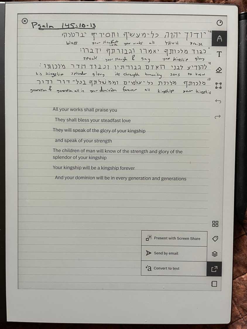 | 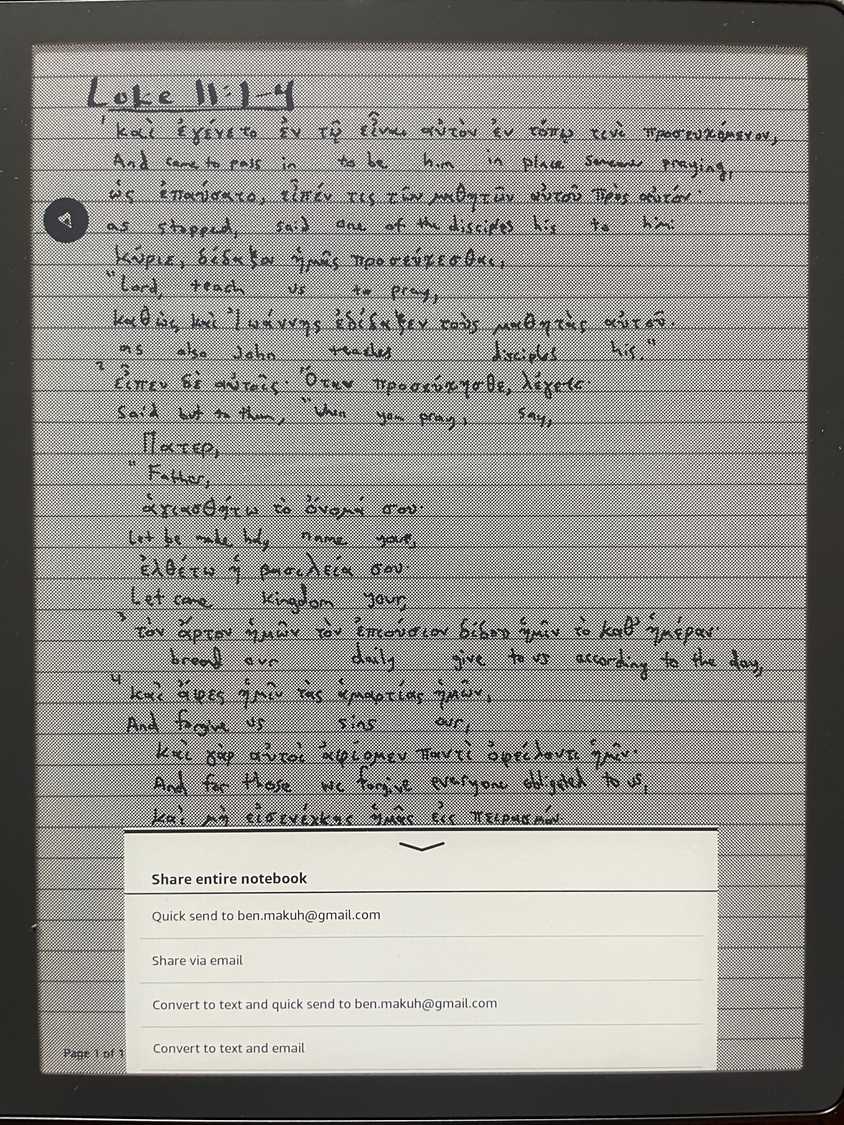 |
| Emailing on the reMarkable | Emailing on the Scribe |
This is the easiest, most reliable way to get your notes off-device that I've found. reMarkable also integrates directly with Google Drive, OneDrive, and Dropbox, and they have a one-tap PDF export that way too. I don't use OneDrive or Dropbox, though, and I try to avoid sending my data to Google whenever possible, so those integrations aren't particularly valuable to me.3 These integrations admittedly make sense, though, given that much of the world's documents flow through them.
As far as getting documents onto the device, the best way to do that for the Scribe is using Send to Kindle, which you'll be used to if you're within the Kindle ecosystem already. For the reMarkable, it's as simple as dragging a PDF or ePub onto the desktop app and then waiting for it to sync. Both have extensions for Chrome and MS Word to support sending web pages and documents to your device. It's worth mentioning that unless you pay $3/month for reMarkable's Connect service, a document will only sync changes back to your desktop/mobile apps for a couple of months, and then you're out of luck. Given that they're paying to run web services to enable this syncing, it's fairly reasonable that they'd use this as an upsell opportunity, but it's worth knowing ahead of time that if you forego that service you'll likely deal with some inconvenience.
Overall, the sync/export story is workable, but not that smooth. It seems to me like both companies have indexed hard on providing conveniences like 3rd party integrations, emailing, and mobile/desktop apps without nailing down the basics of file access. It makes sense somewhat because they both use proprietary file formats for notes that you can't easily do anything with on a computer. Still, it means my ability to control my own data is at the mercy of what features they decide to build into their apps and services. That's not a fantastic feeling.
Software Updates
The piece I wanted to save for last is where the reMarkable's small company size shines. It's just pretty obvious that they have an attention to honing the device that Amazon does not have and likely will never have.4 The Kindle Scribe at its launch was mostly lauded by tech journalists as "Pretty okay" and "A reMarkable killer… if it provided more features." To be fair, the Scribe has received software updates since its launch that make it a relatively more useful device, but it honestly still feels pretty under-baked to me nearly two years after its launch. You can take a look at their (fairly underwhelming) release notes for yourself.
- In January 2024, they rearranged the settings panel and allowed you to delete things with the lasso tool.
- In February 2024, the change log was the boilerplate of "bug fixes and performance improvements."
- The most recent update (July 2024) was just about making it easier to get stuff from your Amazon wish lists.
It's not that these are bad things, and indeed I'm glad that the Scribe team has been given the bandwidth to fix bugs and performance problems. But it's just that when you compare it to the release notes you get from reMarkable, it's night and day.
Every time there's a reMarkable update (which is every month or two), I receive a well-designed blog post about it (with screenshots!) outlining new features and how they would expect me to use them. More than that, though, the features they add reflect a vision for the device—a direction!—that is simply lacking from the Amazon ethos. Some of the recent features they added at the time of this writing include:
- Improvements for left-handed writers (me!) that improve palm rejection technology.
- Better typography for typed text, including a new serif font for titles that not only feels elevated, but improves the readability of a note.
- A more thoughtfully designed "My Files" interface to make it easier for you to manage your notes.
- The option to dock two different pen tips to your toolbar for quicker switching
It's obvious that they as a company are heavily invested in making this as pleasant of a writing experience as it can be, and that the features they build reflect that. I don't mean for this to be an Amazon-bashing session (I really don't!)! When I read their release notes, though, it doesn't give me the sense that this product is tacking in any specific direction as much as that it's doing the bare minimum to keep the Scribe as the slightly more default choice for consumers over and against competitors like reMarkable. It's like Goodreads; nobody I know really thinks Goodreads is ✨ amazing ✨ as much as that it does social book tracking good enough, and it's where the critical mass of readers are compared to the alternatives.
Ultimately, Amazon's device feels like yet another Amazon device—with everything that implies—while the reMarkable feels like my device. It's a tool oriented around my content rather than around the company's ad revenue. The software updates that come out make this device ever more useful to me as a writer, while Amazon's updates kind of do that, but mostly just keep the device afloat.
Conclusion
I've long been interested in e-ink tablets. I genuinely think e-ink might hold some of the most raw potential of any technological innovation today. A digital device that nonetheless uses so little power that its battery can last for months on end is not only convenient, it's great for the environment. We're all so used to a digital world where we charge multiple devices all the time (sometimes even more than once a day!) that we don't even think about it anymore. But stop for a moment and think about the collective cost of billions of people using that much energy all the time for everyday things! E-ink just seems like a much more responsible kind of display technology.
The other terrible cost of digital devices is that they are largely designed to keep us coming back over and over again all day long. But the reason they're so effective in bringing us back is not because they're delivering tons of real value, but because they create cycles of addiction. Feverishly swiping through TikTok for hours doesn't really make my life substantively better, but it makes me feel in the loop. What's more, though, it keeps me focused on consuming content rather than thinking my own thoughts and contributing value to the world. As a writer, I'm powerfully drawn to a device that is structured around my content creation goals.
That's why I'm so excited about e-ink. When I use it, it feels like the device is my tool, rather than vice versa. It makes it easy for me to focus on the words I need to write rather than to focus on getting a hit of a shiny, glowing app-diction. E-ink is a genuinely astonishing confluence of digital conveniences with real-world affordances, and I feel privileged to get to use it.
I bought the Kindle Scribe when it first came out, and then I purchased the reMarkable about 10 months later. I've tried to use both of them to give them a fair shake. The reMarkable comes up short on battery life, pixel density, screen refresh rate, hardware features like a backlight, a good ebook reader, dark mode, etc. You have to pay a monthly fee to use their sync service on top of the high cost of the device, and even then, I still don't have the level of control over my own data that I'd like. And then there are minor annoyances about the reMarkable, too, even more than I could list out in this blog post.
Despite all that, I would unhesitatingly choose the reMarkable over the Scribe. Even with all those downsides, it still has become the device I reach for first. I simply don't have the confidence that the Scribe is ever going to be anything more than fine. I don't believe that Amazon's incentives are ever going to be meaningfully aligned with mine. The reMarkable company is incentivized to make a device that's great for people who need to get stuff done; Amazon is incentivized to make a device that's great for serving yet more ads. There's plenty that the Scribe got right, but after a year and a half of updates the message seems to be, "Don't expect greatness," while reMarkable's message seems to be, "We're an exponentially smaller company, and you'll see our attention to the craft in the details." That's why, if you're shopping between the Kindle Scribe and the reMarkable, I'd recommend the reMarkable.
- Amazon has started to introduce some "write-on" books in their store which, as the name implies, allow you to write directly on the book instead of in hidden away notes. These are mostly things like Sudoku books, crosswords, planners, etc. It's not nothing, but it's also not the general ability to annotate like you can with a paperback or a Kobo ePub.↩
- Daylight, hit me up if you want me to review it 😄↩
- iCloud support, please!↩
- I was discussing this with a friend, and the reality is that despite the fact that Amazon has a veritable army of the world's best software engineers, the sheer size of the company inhibits them from working as nimbly or with as much focus as a smaller company can.↩